There are many ingredients to a quality crafted logo that help tell a story and create an impression. They are color, shape, and form. These three primary elements should capture the mood and inspire loyalty and team spirit. But there are some logos that just can't make the cut.
The New York Jets
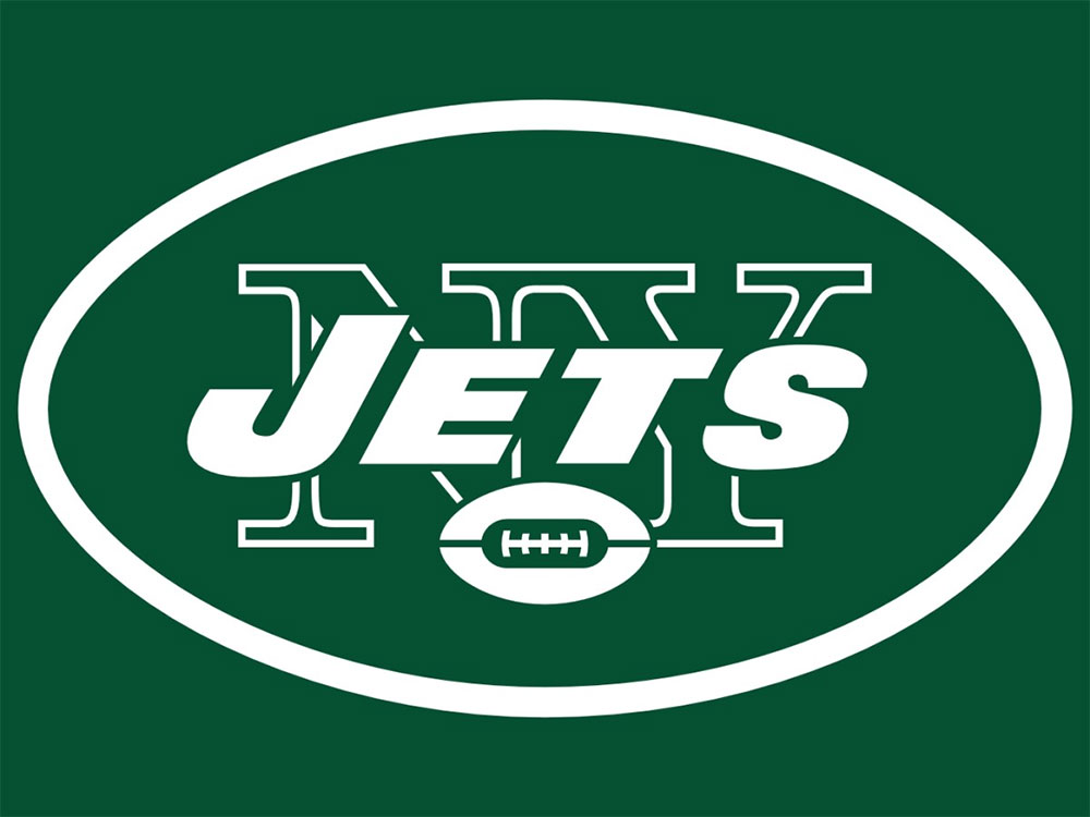
First on our list is the New York Jets alternate logo. This hideous spinach green monstrosity leaves much to the human imagination. Could it be a set of airplane wings hovering over a football, or an Angry Bird with a stitched up mouth? You decide.
The Tampa Bay Buccaneers
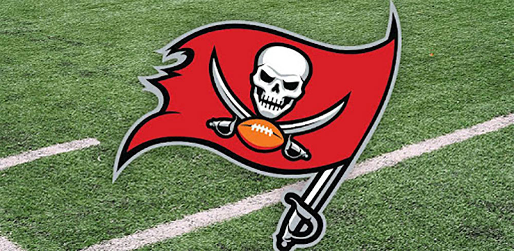
Maybe intimidation wasn't on the designer's mind when they created this wicked pirate with teeth clutching a sword. But try telling that to the fans. The pirate looks like a classic devil cast in pure red and tipping a stinky wink under a fancy featured hat.
The Denver Nuggets
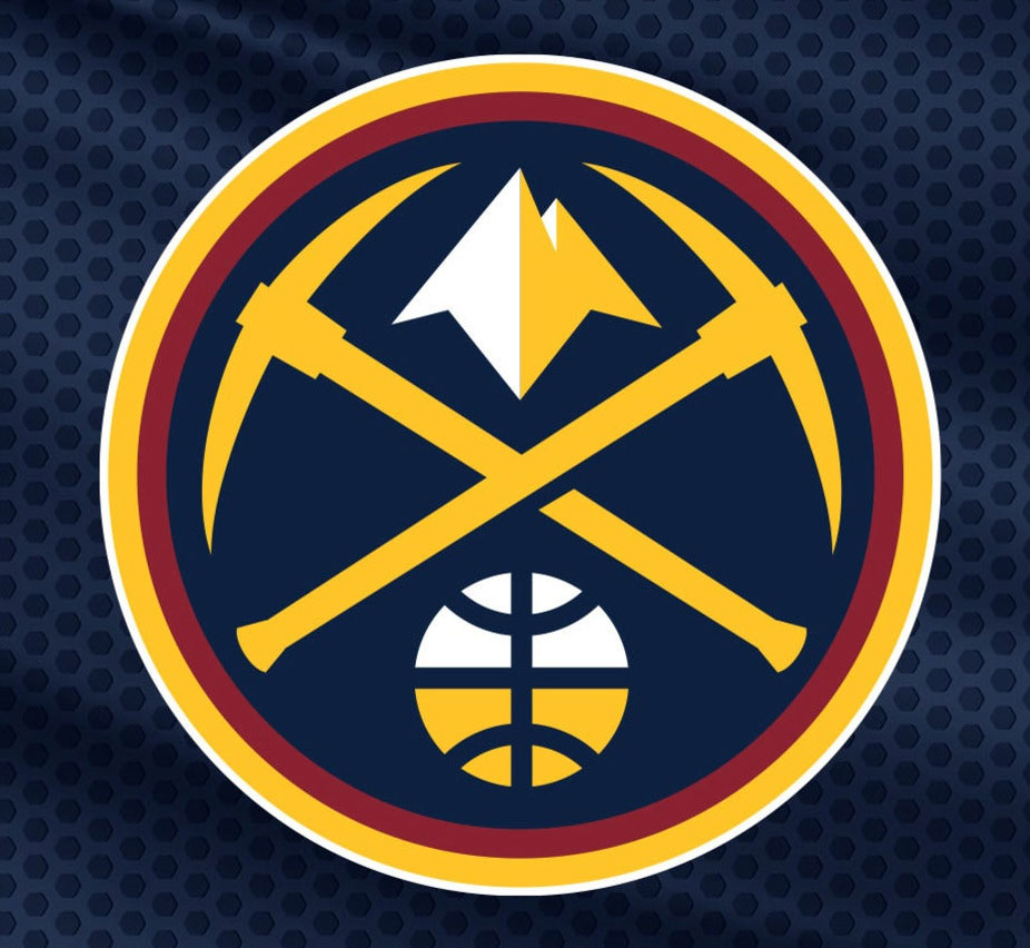
Whoever designed this one must be a huge Tetris fan. You can see a skyline of rainbow colored Lego blocks with white houses in the background. Not bad for 1982, but it would make a poor fit for today's sports fans.
The Anaheim Mighty Ducks
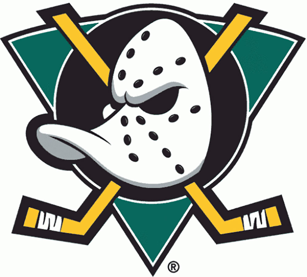
Imagine Donald Duck sporting a mask and hockey stick with a cape on. How would Disney lovers feel? What makes this one really stand out is the mask. It seems to give old Donald that horrifying Jason Vorhees look.

